
by Abe Sherman
There are some exciting new reporting capabilities already available and others that will be available soon in Balance to Buy™. The one that I’ll share today is the Period-to-Period option which was recently added to the Summary Detail Reports. Period reports let you compare productivity over long periods of time, in addition to the 12 month-rolling data that you see when you first log into BTB.
The By Period drop down menu is found in the upper right-hand corner of the Summary Detail reports just under the Detail Column menu. The default for this option is None, but then you have the option of selecting Week, Month, Quarter or Year for your period choices.
All Summary Detail reports begin by showing you data from the past 12 months. If you wanted to see how a vendor was doing by month over the past year, for example, you would leave the Sales Start Date and Sales End Date set to the dates the report begins with and select Month in the By Period drop-down menu.
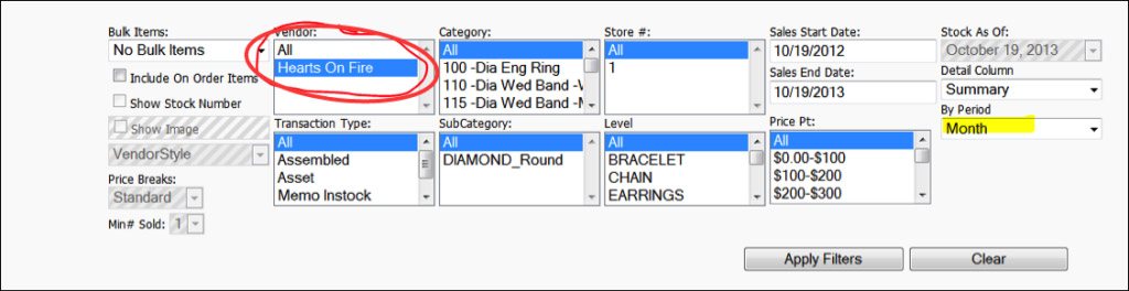
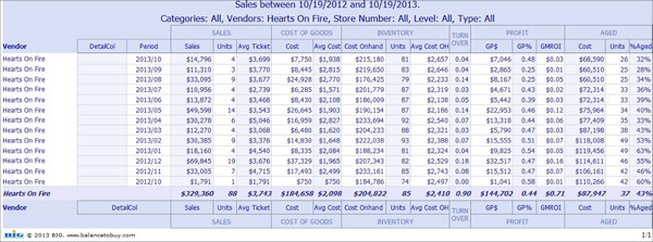
Then you’ll see sales and inventory from each month over the past 12 months. Of course we can drill down further and analyze this vendor by category or price point (or both) over any period as well. As you can see below, a new column, Period has been added to the report to the right of the DetailCol that display’s the results of whichever period you have selected (in this case Month).
If you wanted to take a longer view, for example, analyzing a category’s performance over several years, you would select By Period: Year. In this case you would change the Sales Start Date to an earlier date so you can see trending over that time. In the example below, I changed the Sales Start Date to 1/1/2010, while leaving the Sales End Date to the default setting, which would be the latest date we have data.
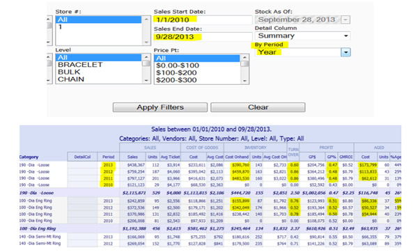
Reading the report, the latest information is at the top of the column, going backward in time as you move down the column. When you look at the year-over-year results, you will see the year-end changes in Sales, Cost of Goods, Cost OnHand, and the Key Performance Indicators that we continually track; Turnover, Gross Profit Dollars, GP%, GMROI and Aged.
In the example above, looking at the year 2010, you will see partial information listed for both Sales and Cost OnHand. Sales are only showing from whenever we began getting data and your inventory is showing at $0. That’s because we didn’t start saving month-end information until about three years ago (in anticipation of building these period reports). The year 2011 onward should be complete for most of our clients. If you would like your history to go back further than it does, please send an email to Mark and he may (in most cases) be able to upload more of your history.
It’s important to note that the current year we are in (2013 in this case) is going to begin on Jan 1, but ends the last day we have data for you, in this example, September 28, 2013. So the results for the current year will be year-to-date numbers if you keep your Sales End Date to the latest available. You can leave the default Sales End Date or change the report’s parameters to end on 12/31/2012 if you prefer to compare periods for complete years.
The summary at the bottom of each of the categories are showing totals in some of the columns and averages in others. Please schedule a call with us to discuss.
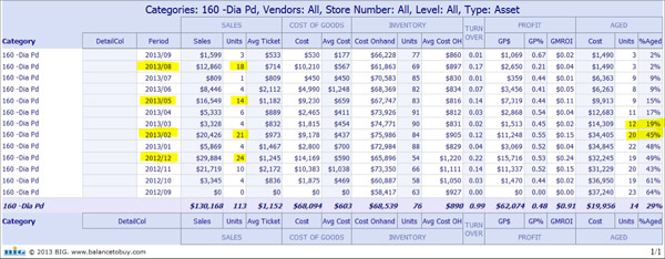
Period reports are going to be very useful for you for doing seasonal analysis. Below is an example of how Diamond Pendants are doing throughout the past 12 months. It’s no surprise that the category does the best in December, February and May… but why August? This jeweler has an inventory reduction sale in August and blows out inventory. What became clear when looking at the monthly reports is how few items are being sold most of the year relative to the inventory levels. In the months September, July, June, April, March, January and October of last year, no more than 6 diamond pendants were sold during the month, but typically it was just 4. Compare that with the number of items on hand at any one time during the year and you can see how much inventory we are carrying throughout the year to sell just a few pieces.
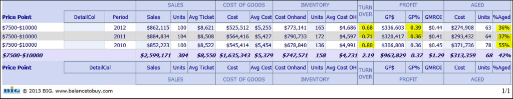
To demonstrate yet another use of the period reports, below is an example of a single price point for all categories over a three year period. You can see how consistent sales in the $7,500-$10,000 retail price range has been over the past few years, the 3% improvement of gross profit this jeweler has been able to achieve and the significant improvement of getting aged inventory down over that time!
In the coming weeks and months, you are going to see other new reporting options and additional reports that have been in the planning stages for a long time. The period reports are a step in the direction we are heading – to provide you with the analysis tools to help you make better decisions faster. Please spend some time in Balance to Buy running various period reports so you can get a feel of how these work. I strongly recommend that you contact Nola or me to schedule a demo with us if you have not had the opportunity over the past few weeks. And as always, we look forward to your comments.